Descriptive statistics are an essential component of any research project, serving as the initial step in the data analysis process. While they may appear simple from a mathematical perspective, they play a pivotal role in research and decision-making. Often overshadowed by the allure of inferential statistics, descriptive statistics are foundational and provide researchers with a profound understanding of their data. In this article, we will explore the various types of descriptive statistics, from measures of central tendency and dispersion to those that help analyze data distribution. Each type serves a unique purpose, offering valuable insights into data characteristics, spread, and shape.
What is Descriptive Statistics?
Descriptive statistics is a fundamental branch of statistics that involves summarizing and presenting data in a meaningful and informative way. It provides a concise overview of a dataset by utilizing various measures and graphical representations. Here are different perspectives on descriptive statistics from various writers:
The Classic Approach by Ronald A. Fisher: Ronald A. Fisher, a renowned statistician, once described descriptive statistics as follows: “Descriptive statistics are like the artist’s brush; they help us paint a clear and vivid picture of data, enabling us to see patterns, trends, and characteristics within the numbers” (Fisher, 1921).
The Practical Perspective by Andy Field: In his popular statistics textbook, Andy Field emphasized the practicality of descriptive statistics: “Descriptive statistics are the toolbox of the data analyst. They include measures like the mean, median, and standard deviation that allow us to understand our data and communicate its essence effectively” (Field, 2013).
The Interpretive Angle by David S. Moore: David S. Moore, an influential statistics educator, once stated: “Descriptive statistics transform raw data into meaningful information. They help us uncover the story within the numbers and interpret what the data is telling us about a particular phenomenon” (Moore, 2015).
The Insightful Overview by John W. Creswell: John W. Creswell, a specialist in research methodology, provides insight into the importance of descriptive statistics in research: “Descriptive statistics offer a concise, bird’s-eye view of data, allowing researchers to identify central tendencies and variations, facilitating the interpretation of research findings” (Creswell, 2014).
The Visual Perspective by Edward R. Tufte: Edward R. Tufte, a pioneer in data visualization, underscores the role of graphs in descriptive statistics: “Descriptive statistics are not confined to numbers; they encompass visuals too. Graphs and charts are powerful tools that provide immediate insights into the data’s patterns and relationships” (Tufte, 2001).
In essence, descriptive statistics are the cornerstone of data analysis, enabling researchers, statisticians, and analysts to summarize, interpret, and communicate data effectively, thereby facilitating a deeper understanding of the underlying phenomena.
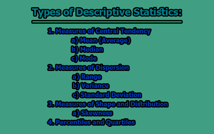
Types of Descriptive Statistics:
Descriptive statistics are used to summarize, organize, and present data in a meaningful way, making it easier to understand and draw insights from the information. There are various types of descriptive statistics, each serving a specific purpose in data analysis. Here are some of the key types of descriptive statistics:
1. Measures of Central Tendency:
Measures of central tendency are statistical tools used to determine the central or typical value within a dataset. These measures provide insights into what is considered a “normal” or “average” value and help summarize the central core of the data.
a) Mean (Average): The mean, also known as the average, is one of the most common measures of central tendency. It is calculated by adding up all the values in a dataset and then dividing that sum by the number of data points.
Formula: The mean is calculated as follows:
Mean = (Sum of all data values) / (Number of data values)
Example: Consider a dataset of test scores for a class of students: [80, 90, 75, 85, 95]. To find the mean, you sum up all the scores and divide by the total number of scores:
Mean = (80 + 90 + 75 + 85 + 95) / 5 = 85
The mean test score for this class is 85.
Use and Interpretation: The mean provides an estimate of the “center” of the dataset. It’s sensitive to extreme values, also known as outliers. Therefore, if the dataset contains extreme values, the mean may be skewed in their direction. It’s essential for understanding the average value within a dataset and making generalizations.
Example Usage: Mean is often used to calculate the average salary of a group, the average temperature for a month, or the average age of a population.
Considerations: Be cautious when using the mean if your dataset has outliers, as it can be influenced by them. In such cases, the median might be a better measure of central tendency, as it is more robust to outliers.
The mean is a valuable statistic for summarizing the central tendency of data, making it easier to interpret and draw conclusions about what is typical within the dataset. However, it is important to be aware of the data’s distribution and the potential impact of outliers when interpreting the mean.
b) Median: The median is another measure of central tendency that represents the middle value of a dataset when the data points are arranged in either ascending or descending order.
Calculation: To find the median, you first order the data. If there is an odd number of data points, the median is the middle value. If there is an even number of data points, the median is the average of the two middle values.
Example: Consider a dataset of salaries: [40,000, 35,000, 50,000, 45,000]. To find the median, first, arrange the data in ascending order: [35,000, 40,000, 45,000, 50,000]. Since there is an even number of data points (4), the median is the average of the two middle values:
Median = (40,000 + 45,000) / 2 = 42,500
The median salary for this dataset is $42,500.
Use and Interpretation: The median is a robust measure of central tendency and is less affected by extreme values (outliers). It represents the middle value, making it particularly useful for datasets with skewed or non-normally distributed data.
Example Usage: Median is often used to describe the median household income, the middle exam score in a dataset, or the median home price.
Considerations: The median is particularly valuable when you want to understand the central value without being influenced by extreme values in the dataset. It’s especially useful when the data is not normally distributed.
c) Mode: The mode is the value that occurs most frequently in a dataset. A dataset can have one mode (unimodal), more than one mode (multimodal), or no mode if no value is repeated.
Calculation: To find the mode, identify which value occurs with the highest frequency in the dataset.
Example: Consider a dataset representing the number of products sold in a store on different days: [10, 8, 12, 10, 15, 8, 10]. The mode is the value that occurs most frequently, which is 10 in this case, as it appears three times.
Use and Interpretation: The mode provides information about the most common value in a dataset, making it suitable for identifying peaks or clusters within the data. It’s particularly useful for categorical or discrete data.
Example Usage: Mode is often used to determine the most common blood type in a population, the most popular choice in a survey, or the most common color of cars in a parking lot.
Considerations: Unlike the mean and median, the mode does not provide a measure of the central tendency in terms of an average value. It is most appropriate for datasets with discrete values, such as categories or counts.
Measures of central tendency (mean, median, and mode) are crucial in understanding the central core of a dataset and the typical values within it. They each have their strengths and are used based on the nature of the data and the research questions being addressed.
2. Measures of Dispersion:
Measures of dispersion, also known as measures of variability, provide insights into how data is spread or scattered within a dataset. They help us understand the degree of variability or how far data points deviate from the central tendency.
a) Range: The range is the simplest measure of dispersion and represents the difference between the maximum and minimum values in a dataset.
Calculation: To find the range, subtract the minimum value from the maximum value.
Example: Consider a dataset of daily temperatures (in degrees Fahrenheit) for a week: [60, 65, 70, 75, 80, 85, 90]. To find the range, subtract the minimum temperature from the maximum temperature:
Range = 90°F – 60°F = 30°F
The range of temperatures for that week is 30°F.
Use and Interpretation: The range is a straightforward measure of data spread and provides a basic understanding of the variability in the dataset.
Example Usage: Range is often used to describe the range of salaries within a company, the range of ages in a population, or the range of test scores in an exam.
Considerations: While the range is easy to calculate and understand, it is sensitive to outliers. A single extreme value can greatly influence the range.
b) Variance: Variance measures the average of the squared differences between each data point and the mean. It quantifies how data points deviate from the mean.
Calculation: Variance is calculated using the following formula:
Variance = Σ(xi – μ)² / N
where xi represents each data point, μ is the mean, and N is the total number of data points.
Example: Consider a dataset of the ages of students in a class: [18, 19, 20, 22, 23]. To find the variance, calculate the squared differences between each age and the mean (20.4), and then take the average of these squared differences:
Variance = [(18-20.4)² + (19-20.4)² + (20-20.4)² + (22-20.4)² + (23-20.4)²] / 5 ≈ 3.04
The variance of the ages is approximately 3.04.
Use and Interpretation: Variance quantifies the average dispersion of data points from the mean. A higher variance indicates greater variability, while a lower variance suggests that data points are closer to the mean.
Example Usage: Variance is commonly used in finance to measure the volatility of stocks, in psychology to assess the variability of test scores, or in quality control to assess the variability of product measurements.
Considerations: Variance is expressed in squared units, which can be less intuitive for interpretation. Taking the square root of the variance results in the standard deviation, which is in the same units as the original data.
c) Standard Deviation: The standard deviation is the square root of the variance. It measures the typical distance of data points from the mean and is expressed in the same units as the original data.
Calculation: Standard deviation is calculated as the square root of the variance.
Example: Using the same dataset of student ages as above, the standard deviation is found by taking the square root of the variance (approximately 3.04):
Standard Deviation = √3.04 ≈ 1.74 years
The standard deviation of the ages is approximately 1.74 years.
Use and Interpretation: The standard deviation provides a more interpretable measure of data dispersion than variance. It indicates the typical spread of data points from the mean.
Example Usage: Standard deviation is widely used in various fields, such as in finance for risk assessment, in healthcare for assessing patient data variability, or in manufacturing for quality control.
Considerations: The standard deviation is a commonly used measure of data variability because it provides an easily interpretable value in the same units as the original data. It is particularly valuable for comparing variability across datasets.
Measures of dispersion (range, variance, and standard deviation) are essential for understanding the degree of spread or variability within a dataset. They help us assess how data points deviate from the central tendency and provide valuable insights for making comparisons and drawing conclusions.
3. Measures of Shape and Distribution:
These statistics describe the shape of the data distribution and provide insights into how the data is distributed.
a) Skewness: Skewness is a measure of the asymmetry or lack of symmetry in a data distribution. It indicates whether the data distribution is skewed to the right (positively skewed) or to the left (negatively skewed).
Calculation: Skewness is calculated using the formula:
Skewness = 3 * (Mean – Median) / Standard Deviation
Example: Consider a dataset representing the distribution of household incomes. If the calculated skewness is positive (e.g., 2.5), it suggests a rightward skew, indicating that the data distribution is stretched to the right with a tail on the right side.
Use and Interpretation: Skewness helps us understand the shape of the data distribution. A positive skew suggests that the data is concentrated on the left side with a long tail to the right, while a negative skew indicates the opposite.
Example Usage: Skewness is commonly used in finance to assess the skewness of stock returns, in economics to analyze income distributions, and in biology to understand species population distributions.
Considerations: Understanding skewness is crucial for selecting appropriate statistical analyses. For example, if data is positively skewed, it may be better to use non-parametric tests or transformations to account for the skew.
Measures of shape and distribution, such as skewness, provide insights into the overall shape and symmetry of a data distribution. They help researchers and analysts understand the underlying characteristics of the data, which can be essential for selecting the right statistical methods and drawing meaningful conclusions.
4. Percentiles and Quartiles:
Percentiles and quartiles are used to divide a dataset into equal parts, making it easier to understand the position of specific values within the data distribution.
a) Percentiles: Percentiles divide a dataset into 100 equal parts. Each percentile represents the value below which a certain percentage of the data falls.
Calculation: To calculate a specific percentile, you first arrange the data in ascending order and then determine the position of that percentile in the ordered list. This position can be calculated as (P/100) * N, where P is the desired percentile and N is the number of data points.
Example: Suppose you have a dataset of test scores, and you want to find the 75th percentile. If you have 100 data points, the position of the 75th percentile is (75/100) * 100 = 75. Therefore, the 75th percentile is the value at the 75th position in the ordered list.
Use and Interpretation: Percentiles provide valuable information about the relative position of a specific value within the dataset. The 50th percentile is the median, and other percentiles can help identify data distribution characteristics.
Example Usage: Percentiles are frequently used in standardized testing to understand how a student’s score compares to the scores of others, in growth charts to assess child development, and in economics to analyze income distribution.
Considerations: Percentiles are essential for understanding how values compare to a larger dataset. For example, the 90th percentile indicates that a data point is higher than 90% of the data.
b) Quartiles: Quartiles divide a dataset into four equal parts. The three quartiles are the first quartile (Q1), the second quartile (Q2), which is the median, and the third quartile (Q3).
Calculation: To calculate quartiles, you first order the data. Q1 is the 25th percentile, Q2 is the median, and Q3 is the 75th percentile. These quartiles help divide the data into four equal parts.
Example: Consider a dataset of exam scores: [60, 70, 75, 80, 85, 90, 95]. To calculate quartiles, first, order the data. Q1 is the 25th percentile (second value, 70), Q2 is the median (fourth value, 80), and Q3 is the 75th percentile (sixth value, 90).
Use and Interpretation: Quartiles provide insights into the distribution of data, particularly for identifying the spread between the lower and upper halves of the data.
Example Usage: Quartiles are often used in box-and-whisker plots to visualize data distribution, in healthcare to analyze patient data, and in education to evaluate exam score distributions.
Considerations: Quartiles help assess the variability and central tendency of data, making them useful for understanding data distribution characteristics.
Percentiles and quartiles are important for understanding the relative position of specific values within a dataset and for dividing data into equal parts. These statistics are widely used in various fields to analyze data distribution and make informed comparisons.
In conclusion, descriptive statistics are indispensable in research for several critical reasons. They facilitate a deep understanding of sample characteristics, making data more approachable and comprehensible. Moreover, they assist in data cleaning and validation by highlighting potential anomalies and inconsistencies. Descriptive statistics provide the foundation for quantitative analysis, serving as the launchpad for more complex statistical tests. They inform decision-making by guiding researchers in selecting the appropriate inferential statistics based on the characteristics of their data. Finally, it is worth noting that in many research scenarios, descriptive statistics can stand alone, offering meaningful insights without the need for advanced statistical analyses. As such, it is imperative to recognize the vital role that descriptive statistics play in the research process and not to overlook their significance in favor of more complex statistical methods.

is an experienced educator and academic currently serving as a Lecturer at Nurul Amin Degree College. With a career dedicated to student development and institutional excellence, he brings a wealth of classroom expertise and pedagogical knowledge to his current role. Before joining the faculty at Nurul Amin Degree College, he served as an Assistant Teacher at Zinzira PM Pilot School and College.


